How do other trading UIs do it? Well, here is a collection of screenshots and annotations in a figma file and below are a few highlights…
Layout
The vertical order book is pretty typical, as is some sort of depth chart. In some cases you can see the bids and the asks next to each other. Occasionally you’ll get a depth visualisation on the candle chart. 
Cumulative depth, depth at level, and including both
Interestingly there is real diversity over whether to show the volume at a given price or the total volume up to that price from the mid. Sometimes you get both, but rarely a visualisation of both.
There are a couple of places you have a choice. 
Vega Console (below left) shows both “at price” and “cumulative”, it does so to the same scale. Sometimes this can hide significant variations in the volume at a given level. The mock up on the right also shows both but uses two different scales, so that the difference in volume between two levels is emphasised and you still get a sense of the cumulative scale… maybe 
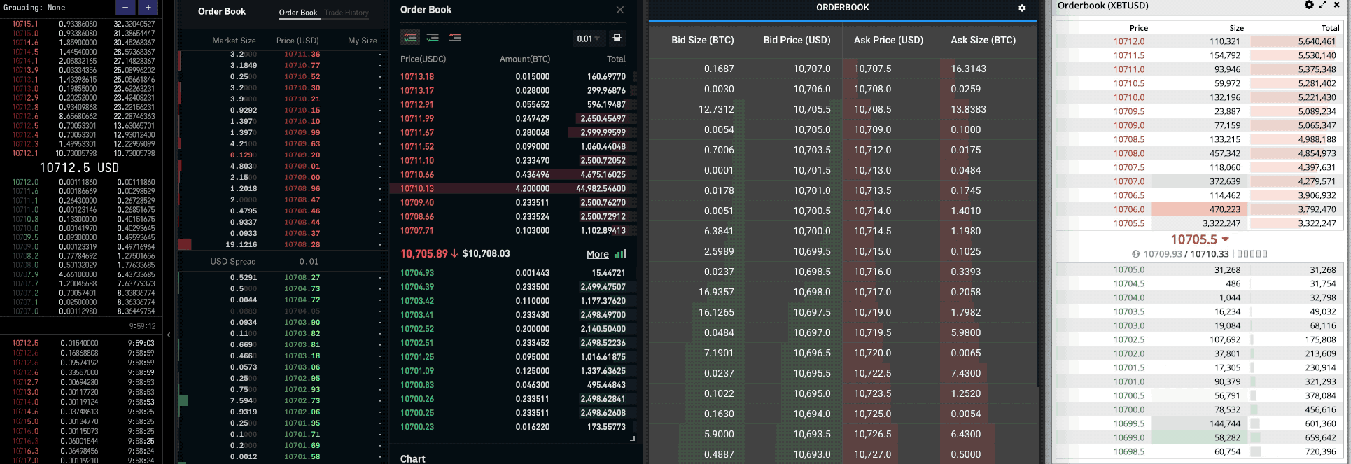
Grouping/aggregation and prices with no orders
Aggregation or grouping is where volume is lumped together at certain price increments rather than having a row for every price. Different UIs allow you to group at different increments: Coinbase starts low then doubles, for example. Others appear to have a handful of hard coded increments, none (that I’ve seen) let you set your own.
Systems that group sometimes have the effect of being like a depth chart in that the vertical axis is smooth, without any gaps. On the left (below) the difference between the best bid and the 6th row is 2.2, but the best ask and the 6th row is 3.8. On the right aggregation means that each row is .50 from the next. You could also choose to show rows for prices that do not have any volume.
On many UIs the depth chart is open along with the orderbook, so you could argue they do different jobs. Although I’d respond that being able to click a price with no orders is handy if you’d rather have a fill earlier and pay .01 for it, or join the back of the queue at a better price. But traders are all different so customisation is often a good call.
Precision and “handles”
FX interfaces often show quotes with the more interesting part of the price in a larger font.
This is sometimes called a handle. I’ve not seen any crypto exchanges that do this although Coinbase Pro and Kraken both use typography to highlight significance. Note the use of light font weight and colour to knock back trailing zeros, or highlight where values are interestly different from preceding rows.
Navigation
The default view is typically centred on the mid price with a 50/50 split between buys and sells, but some offer a way to jump to either the buy or sell side.
A few allow you to scroll to see orders outside of the current view. I’ve not seen a way of indicating you’ve reached the end of the orders. On some exchanges you can’t place orders too far from the mid. Normally I’m not sure what is preventing me from seeing more, this or some API limitation.
Showing your orders
There are a few examples of platforms that show your orders in the book. Kraken does a good job of showing them on the candle and depth chart with little circles.
Coinbase has a column dedicated to showing your open order volume at a price. Trading technologies and ProRealtime have a “ladder” or ticket/order book or DOM style ticket (I had to Duck-Duck-Go it… “Depth Of Market”). This is all about placing, cancelling and editing orders in context of the market depth. 
Placing and editing orders
Most (if not all) allowed you to click on a price in the order book to populate a deal ticket with that price (some do the same thing for the candle and depth chart, too). Kraken’s little dots that show your orders are draggable. The DOM-style books above allow one-click order management without having to touch a separate deal ticket.
Huobi has this feature too, although I’m not 100% sure it is the same, it does appear to allow one-click execution. I assume the icon is referencing Pacman eating the book.
Priority and fill progress
On the crypto platforms, I’ve not seen anything that shows where my order sits in terms of priority at a particular price. The people who placed their limit orders at the same price as me but earlier will get filled before I do, and the people after me will have to wait.
Perhaps we are getting to the differences between pro and retail? I note that Trading Technologies reserves a whole column for fill info (not the same as priority, but if I’ve had some fill I know I’m first). Kraken shows its little dot on either the outside or inside of the depth chart before I make an order, a hint at the difference between joining the book and getting a fill, again not quite a priority. When exploring products built for traders (not by exchanges) I noticed a few things that might do this (above right). As well as some other visualisations that I’ve not dived into yet…
Hover
Few do anything with hover other than highlight the row you are on. Some provide a tooltip that I think is intended to help you understand what average fill you might get on an aggressive limit order order.
Kraken goes to town with hover, it highlights the same level in candle chart, depth chart and book. It also gives you some indicative fill info. :thumbs-up:
Communicating change
We don’t want Vega Console to feel like a slot machine (other exchanges might want that effect) but it might be good to give some sense of what is happening beyond just showing the raw numbers. Have a lot of orders moved, has the volume of buys just shifted, was it because of an aggressive order or a massive edit/cancel?
Here are 10 seconds of a few exchanges doing their thing (full size)…

Coinbase highlights cancels/decreases with grey and increases with Red/Green , Bitmex flash a background colour red/green show a value has changed. At the moment console flashes the parts of a value that have changed red/green depending on the change direction. Some do nothing, and I can see the case for this.
Few do anything in the order book to show matched trades, you could say that is the job of the trades history view, but I think there is potential in the mid/last trade indicator.
Using animation is a nice idea in theory, I’ve not not seen it done well. Perhaps animating the volume bars would work?
Viewing all these order books side by side makes me wonder about tools for comparing market depth across exchanges.
Terminology
IIRC there isn’t a single right answer about what the right word to use is in trading. Here is a quick list of words that are used in no particular order.
B.Order/Buy/Bid/Ask/Sell/S.Order
Size, Vol, Volume
Priority, time-priority
Market size, Price, My Size,
Total, Cumulative, Stack, Amount, Quant, Sum, Cost
Order types
If I were trading big money I might be paranoid about stop orders, I don’t want others to know my targets, but maybe I can’t afford to be close enough to the exchange that my bot will execute my order in time. Either way, I like this visualisation that included stop orders.
For Vega I think there is more potential here, for example showing pegged orders, or ones from liquidity providers, or doing something with the fact that open position data and margin levels will be public. Here is a nice article that looks to visualise “human traders” distinct from the robots (as well as some other interesting things). Bitmex has this auto deleverage thing, I think there is room for innovation here.
Auctions
The thing with auctions is that the bids overlap with the asks. We are going to have to do some overlapping. Hence two columns in the vertical view and an overlap in the depth chart.
What have I missed?
I’ve not spoken much about the depth chart (maybe a follow up post).
It would be great to hear from you. Do you have things that you like to see that I’ve not mentioned, is there anything that is especially important? Do you have any ideas of other ways it could be done? Is there something I am not thinking about?